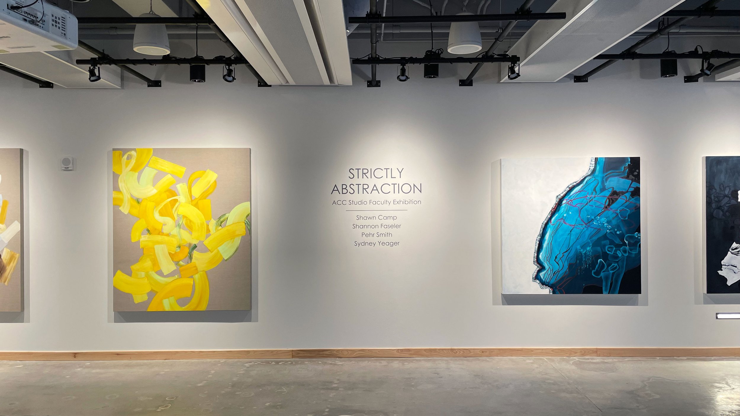
TAG: Strictly Abstraction
2021
The Art Galleries at Austin Community College is comprised of two gallery spaces on the Highland campus.
“We believe that community-wide engagement with the visual arts produces important dialogues, creates new ideas, and gives voice to diverse viewpoints. We value arts education and open artistic expression through exhibitions and programming as a service to ACC and our community.” -The Art Galleries at Austin Community College: Mission Statement & Goals
Goal
Design a printed brochure and social media graphics to provide detailed information about Strictly Abstraction: ACC Studio Faculty Exhibition 2021 and the featured artists (Shawn Camp, Shannon Faseler, Pehr Smith, and Sydney Yeager).
Challenge
Maintaining a clean design and clear visual flow, adhering to TAG’s brand standards, and enticing exhibition-goers through the brochure and social media graphics.
Target Audience
The ACC community (students, faculty, staff, alumni), the greater Austin community, local artists, and sponsors and donors.
Meet the team
Kate Easley (Project Manager), Sonya Hachez (Art Director), Scott Carter (Senior Designer), Edgar Rodriguez (Senior Designer), Dominique Bowman (Junior Designer), Dean Lazzaro (Junior Designer), Liana Owens-Korman (Junior Designer).
In the beginning phases of this project, two separate teams were working on the TAG brochure. Team one included Sonya, Dominique, Scott, and myself. Team two included Edgar, Liana, and Dean. We then merged into one group at the round one digital draft stage to focus all our energy and collaboration on one strong concept.
Layout Inspiration & Sketches
Per the needs and wants of the client, we stuck to sourcing inspiration that radiated clean, modern, and paired down.
At this initial stage, it was all hands on deck. No matter the role, we, as a whole team, participated in ideating and sketching to ensure we had as many ideas generated as possible in a short amount of time. From there, we voted on the strongest sketched concepts to present in our first internal review.
Round One
After receiving feedback from our internal review, we took the two concepts with the highest visual flow, hierarchy, and organization of information and created our first round of digital drafts. Given the fast turnaround of this project, the team split up into two groups: one focused on the brochure design and the second focused on creating the social media graphics. Sonya and I spearheaded the first sub-team along with Dominique.
Since Sonya’s and my concepts were chosen to move on to round one, we both focused on digitizing our sketched concepts with help from Dominique. In addition, Sonya worked tirelessly communicating with several local printers to receive bids for the client’s approval. At the same time, the social media sub-team (Scott, Edgar, Liana, and Dean) put in the hours generating social media graphics that fit multiple sizes and functions.
Typography & Color Palette
We utilized TAG’s brand typography and color palette to maintain consistency and cohesiveness throughout the brand and its assets. We used minimal color in the brochure design and stuck to simple black type on a white background to allow the artwork images to be in the spotlight.
Communications
I became the point of contact and initiated email communications between our team, the client, and the selected printer. My responsibilities in this role included an introduction email between the client and printer, getting last-minute feedback from the client, and ensuring I sent all deliverables on time to meet the print deadline. It was intense! Most of the final communication happened during one day, and I think I sent more emails that day than I have over the course of a week.
Final Solution
The sprint to the finish line was a mad dash. We received fantastic feedback from our client and had limited time to finalize the printer and finish editing our designs. With my concept as the final brochure, I made minor revisions to the layout and corrected the captions usage and placement. Dominique aided me in finding good crops for the four selected artworks to be displayed as posters on the back of the brochure. Equal representation of the artists was of the utmost importance; hence the several poster variations feature one work from each artist. Thank you, Sonya, for coming up with that solution! On the other side, Scott and Edgar made the necessary revisions to the graphics.
Reflection
This project was exciting, fast, chaotic, and an overall incredible learning experience. Our team came together to support each other and make it happen. I’m proud of our hard work. I’m even prouder of the final results. We created a brochure and supporting social media graphics that meet the brief through their clean design and clear visual flow. The layouts are paired back and successfully spotlight the artwork displayed.
I had the opportunity to visit the Strictly Abstraction gallery, and I was in awe of TAG’s careful curation and the size and impact of the individual artwork. It was stunning. It was also so surreal to see our brochure and graphics in the wild. This experience was a first for me, and I won’t forget the feeling.


